Table of Content
Unlike in the old days, 60% of the searches online come from mobile phones, while many websites are desktop friendly hence should learn how to redesign your website for mobile. Websites play an important role for any company. Designing a site, blog, or channel generates more traffic, and that’s the sole purpose of an owner. Additionally, a website is the collection of the content of the services provided by the company.
The content on the company website is a detailed explanation of what the company provides. From the smallest topic to the heading on the website is what helps the customers determine what they want to buy. The accessibility of the website is one of the reasons why people want to buy from your shop.
Why Redesign it for Mobile Use
The websites created for the use of computers cannot properly work on mobile. The programs of the website do not allow the site to understand the working of the mobile system. The use of mobile in the current era is unquestionable. People carry mobile no matter where they go. The mobile phone allows the world to remain in touch with others anytime.
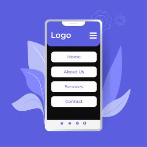
It should be redesigned to make the website work properly on the mobile phone. Mobile phones are smaller than computers and have less space to show the website’s entire content. If the content is displayed according to the computer’s display, the content will be too small for people to understand.
Bad Design on the Mobile
Look at your website on the mobile and wonder why it looks bad. Multiple options are given below!
Responsive Design
The responsive design must adjust the website’s size to the level of the device people use. It ensures the website content is fully adjusted for people to see on any device that customers use. This helps people as they do not have to zoom the content to read it. It also prevents the mistake of clicking as the content is properly being shown to the person.
Responsive design handles the website’s design on any electronic device. The computer can be old as the first generation. No matter the platform, the responsive design helps give users obtain a great experience so they will not leave the website because of the bad experience.
When buying from a company, people focus mainly on the company’s service. The company’s services on the website can greatly inform people what to expect from the company. For this reason, the design of the website is considered very important. The use of product content is greatly responsible for people to understand the product.
Scaling Rules
The website on mobile requires extra information to display the content. Fixing the responsive design can be a great help, but with the advancement of technology, the information to set the website for mobile phones must be handled carefully. The proportion codes are missing when the content on the website is either shrunk or missing.
To obtain maximum content visibility, clear instruction should be given to ensure no problem occurs. The instructions are to explain how the content should be shrunken or stretched.
Un-Optimized images
The images of the website must be optimized to be properly displayed on mobile phones. Otherwise, they will either be blurry or show an error on the mobile screen. The pixel amount on the new mobile versions is greatly compressed to show the text and other information clearly.
When the graphic size is smaller than the pixel, it gets stretched out to display on the screen. This causes the picture to be displayed blurry rather than locking the picture to show the proper result.
Unsupported Media Types
The webpage will load on the mobile but has a problem loading certain content. This happens when the media file of the content is unsupportive of mobile software. An example of the media will be flash media. This media can be used for animation and videos on the desktop but does not work on mobile phones.
Other examples of such media files would be the JavaScript or jQuery elements. While for desktop users, the site will work properly, for mobile interaction, it will either be unresponsive.
Large Media
The large media contain images used when the computer’s internet connection is weak. Websites use large images to display on the screen if the data transfer rate is too slow for the computer to handle the original load. These images will not load on mobile phones since the image size is not compatible with mobile phones.
Optimize the Website for Mobile Devices
Knowing what makes the website give an error when used on mobiles. A user can optimize the website to ensure such problems do not occur again.
Test the Site
To make any change to the website, you must first know how mobile-friendly the website is. You can test the website by personally opening it on different mobiles and tablets to know it’s working. There are tools on the internet that can help you understand what type of changes your website requires to become user-friendly on a mobile phone.
When testing on the tool, the result will show positive if there is no problem with the website. If there are problems with the website, the tool will show the options for improving the website. If there is a problem loading the page, there will be a separate notification showing the page could not be accessed.
Custom CSS
CSS is a big part of implementing responsive web design. CSS is used to implement media queries. This helps the browser understand when different page layouts should be used. The knowledge of CSS can be greatly useful for people when they want to transform their site into a mobile-friendly site.
Responsive Themes and Plugins
Using CMS on WordPress makes it easy for people to create responsive websites. Nowadays, it is fairly simple to create a responsive website. Themes are available on the internet and are made by considering the website’s mobile-friendliness. When buying the theme, the demo will allow the person to understand the working of the theme.
Using Block editor as an Elementor will allow users to check the website across different platforms and devices. If the user properly pays attention to the guidelines, the website will have no problem being mobile-friendly.
Test Core Web Vitals
Core web vitals are a set of metrics that provide insights into the user’s overall experience. Following are the three Core Web Vitals.
First Input Delay (FID)
This metric studies the inactivity of the website. It can help you determine how long the website takes to load fully.
Largest Contentful Paint (LCP)
This metric shows the time it takes for the largest element of the page to load. A low LCP means the page loads quickly.
Cumulative Layout Shift (CLS)
This meter shows exactly how much the page layout shifts as it loads.
Improve the Sites Load Time
In the mobile-friendly world, the website’s loading speed is extremely important. Speed optimization can help you retain more traffic keeping the bounce rate down.
Conclusion
People should learn how to redesign your website for mobile. Today is a mobile-first world. Users now rely on mobile phones to perform any action online. Since mobile phones are easy to carry in pockets, optimizing the websites to work on the mobile is the key to success for any company.


